Building a direct line between participants and the people guiding them
A mobile app for program participants and a desktop messaging experience for case managers, built from scratch to replace phone tag with something better. Validated by stakeholders and designed with enough care that even a 24 hour security delay became a moment of transparency rather than confusion.

My Role:
UX Designer, Consulting
Client:
State Workforce Development Program
Methods:
Competitive Analysis, Persona Development, Product Design, Mobile
TEAMS:
Design, Development, Client Stakeholders
THE STARTING POINT
Phone tag in both directions, with real stakes on both ends.
Case managers would call. Participants would miss it. Participants would call back. Case managers would be busy with someone else. In the meantime, questions went unanswered, deadlines crept closer, and the distance between a person and the support they needed stretched a little wider.
The program also relied on a third party website to post job listings and career event announcements, a tool the state did not own and had no guarantee of keeping if their contractor relationship changed. Information that participants needed to move their job search forward was living somewhere the state could not fully control.
The goal was clear: build something the state owned outright, designed specifically for their participants and their case managers, that would work regardless of who held the contract. Not a workaround. Not an adaptation of someone else's tool. Something built from the ground up with both users in mind from the very first decision.
There is also a policy dimension worth understanding. Proposed legislation holds states financially responsible for SNAP payment error rates that exceed certain thresholds, with penalties that scale significantly based on how far over the line a state falls. A meaningful share of those errors trace back to participants failing to report changes in income or household composition, often because the right person was simply hard to reach. A reliable direct line between participants and their case managers is one practical way to change that.
THE CHALLENGE
Two very different users. One connected experience.
Designing for both a participant on a phone in a waiting room and a case manager at a desktop managing an entire caseload required holding two very different contexts in mind at the same time. Every decision had to work for both without compromising either.
The project came to me after an initial phase with multiple designers. I took on primary responsibility for the participant-facing mobile app while carrying the design language and interaction patterns forward from the case manager experience already established in the broader system redesign. The two needed to feel like parts of the same product even though they lived on very different screens.
The state's decision to build something they could own outright rather than adopt an existing contractor platform shaped the scope of everything that followed.
A note on process: This project was shaped by stakeholder requirements rather than direct user research. The core features were defined up front: direct messaging, document sharing, career event listings, forms access, and office contact information. Design decisions were made within those parameters, with particular attention to the edge cases and communication moments that requirements documents rarely anticipate.
COMPETITIVE ANALYSIS
Before building, we looked at what already existed.
Two platforms were already in play when this project began. MPloy was a feature-rich workforce development app offered by the state's existing contractors, and MobileUp was a third party member engagement app the state had also considered. Neither was the right fit on its own, and understanding why shaped every decision we made in our design.
MPloy was purpose-built for workforce programs and covered job searching, messaging, and document access. But it was contractor-owned, meaning the state would lose access to it if the contractor relationship changed. MobileUp offered strong event and notification features but was designed for member associations, not government benefit participants, and lacked the program-specific features participants needed like forms access and direct case manager communication tied to their case records.
The gap was clear. Neither platform offered what participants actually needed in a system the state could own and maintain independently.

PERSONAS
Understanding who we were designing for.
Personas were developed based on the participant population served by the program and the case managers supporting them. While this project was shaped by stakeholder requirements rather than primary research, these personas were informed by existing knowledge of the program's users and referenced throughout the design process to ground decisions in real human context.

THE PRODUCT
Two surfaces. One connected experience.
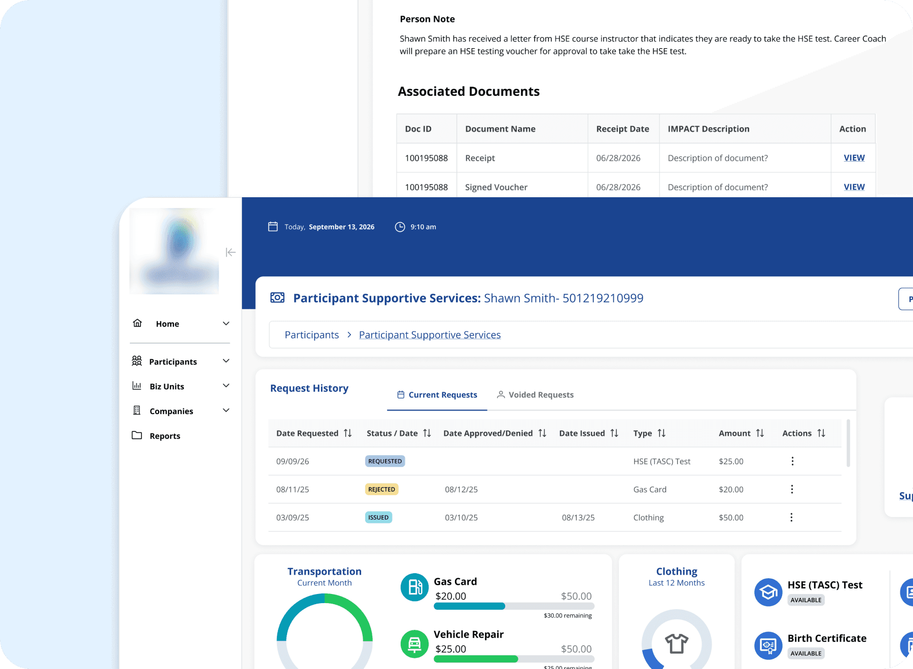
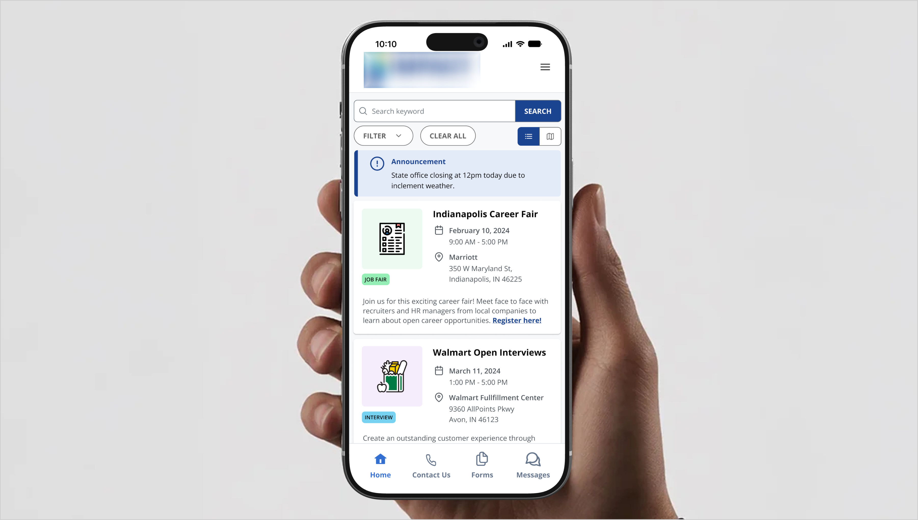
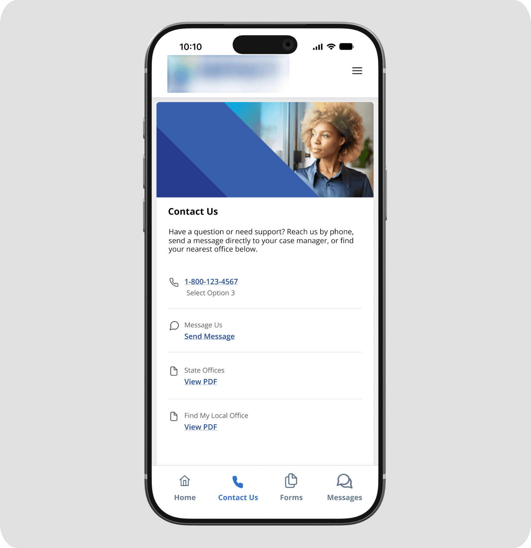
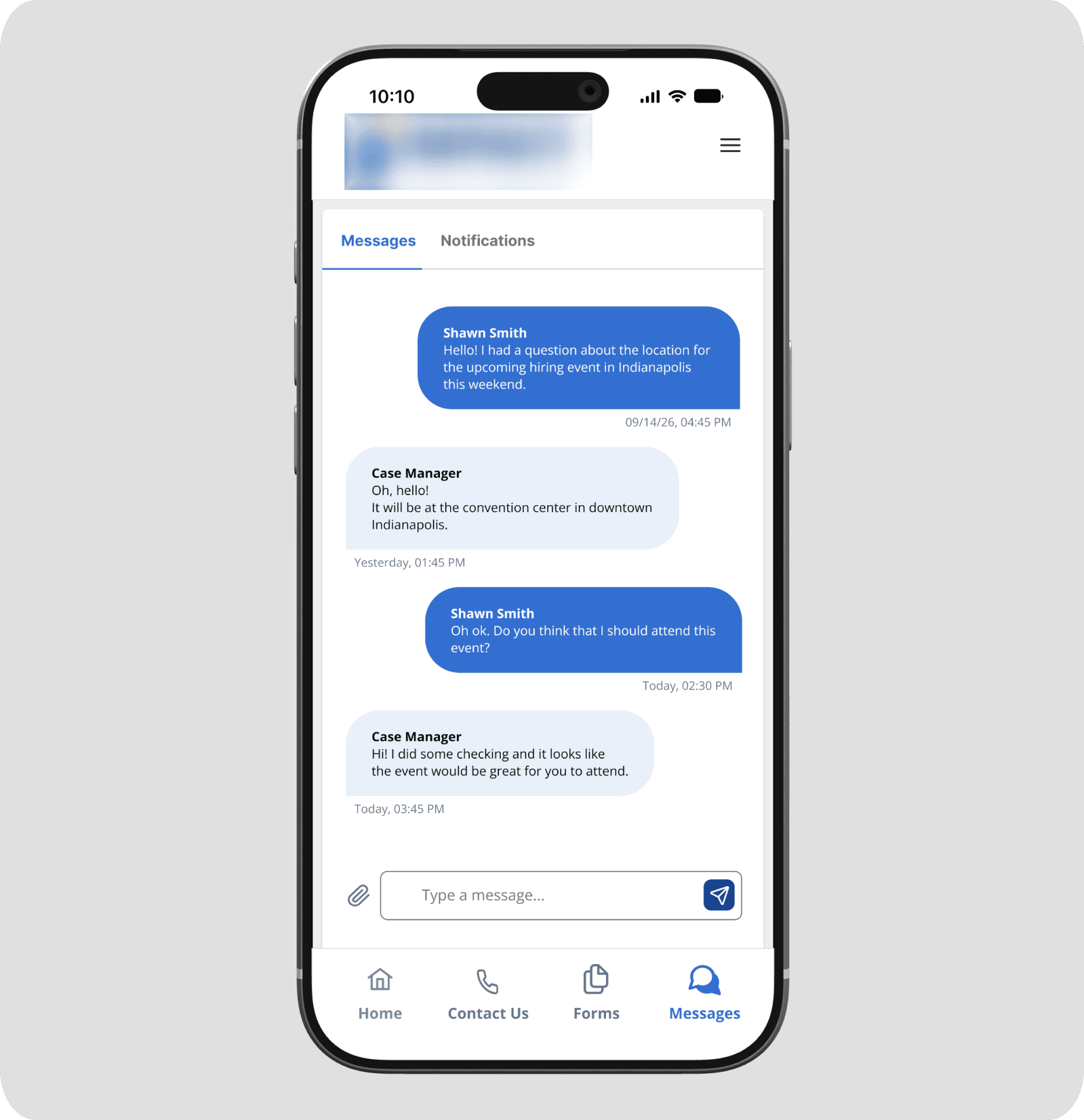
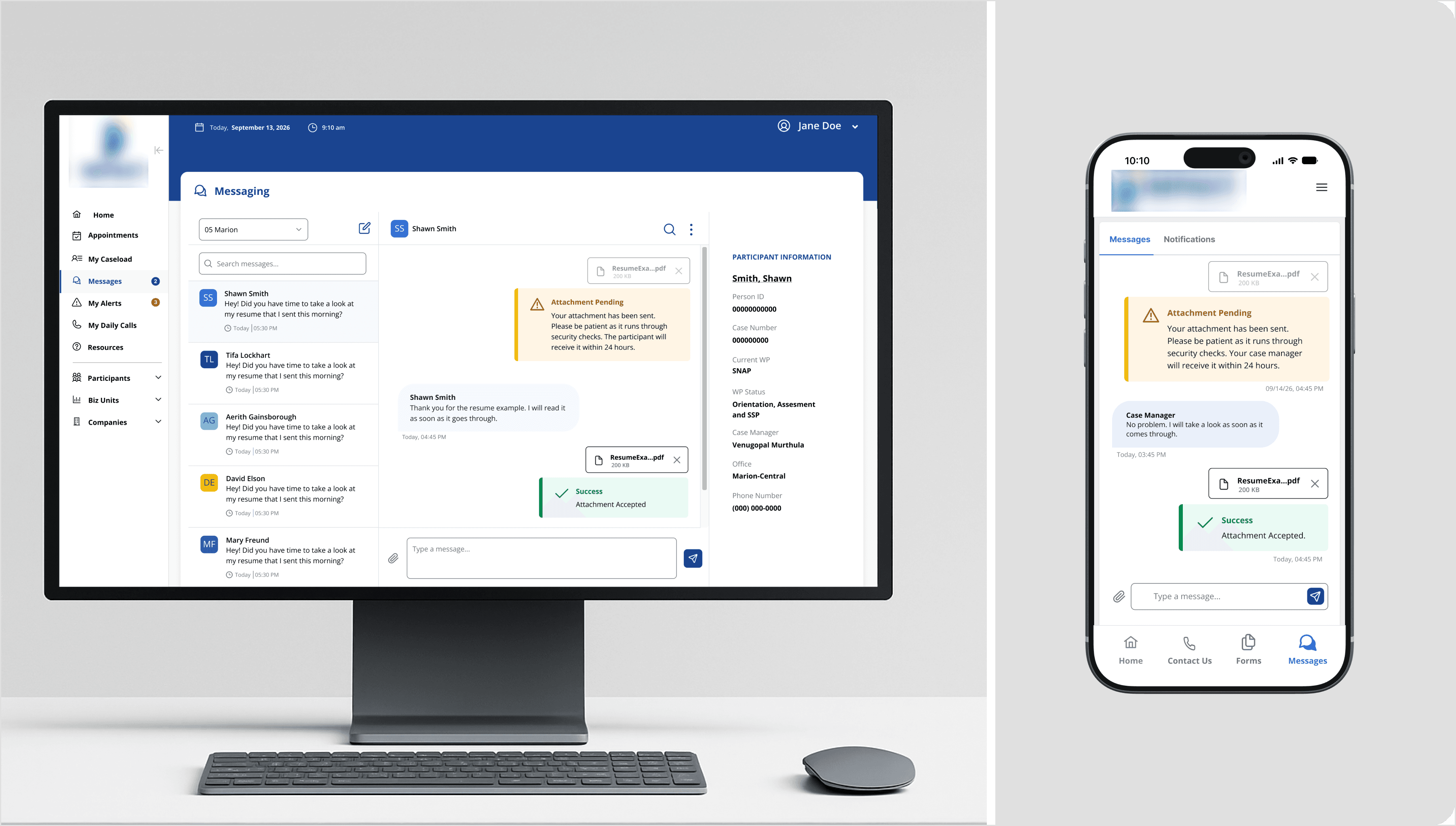
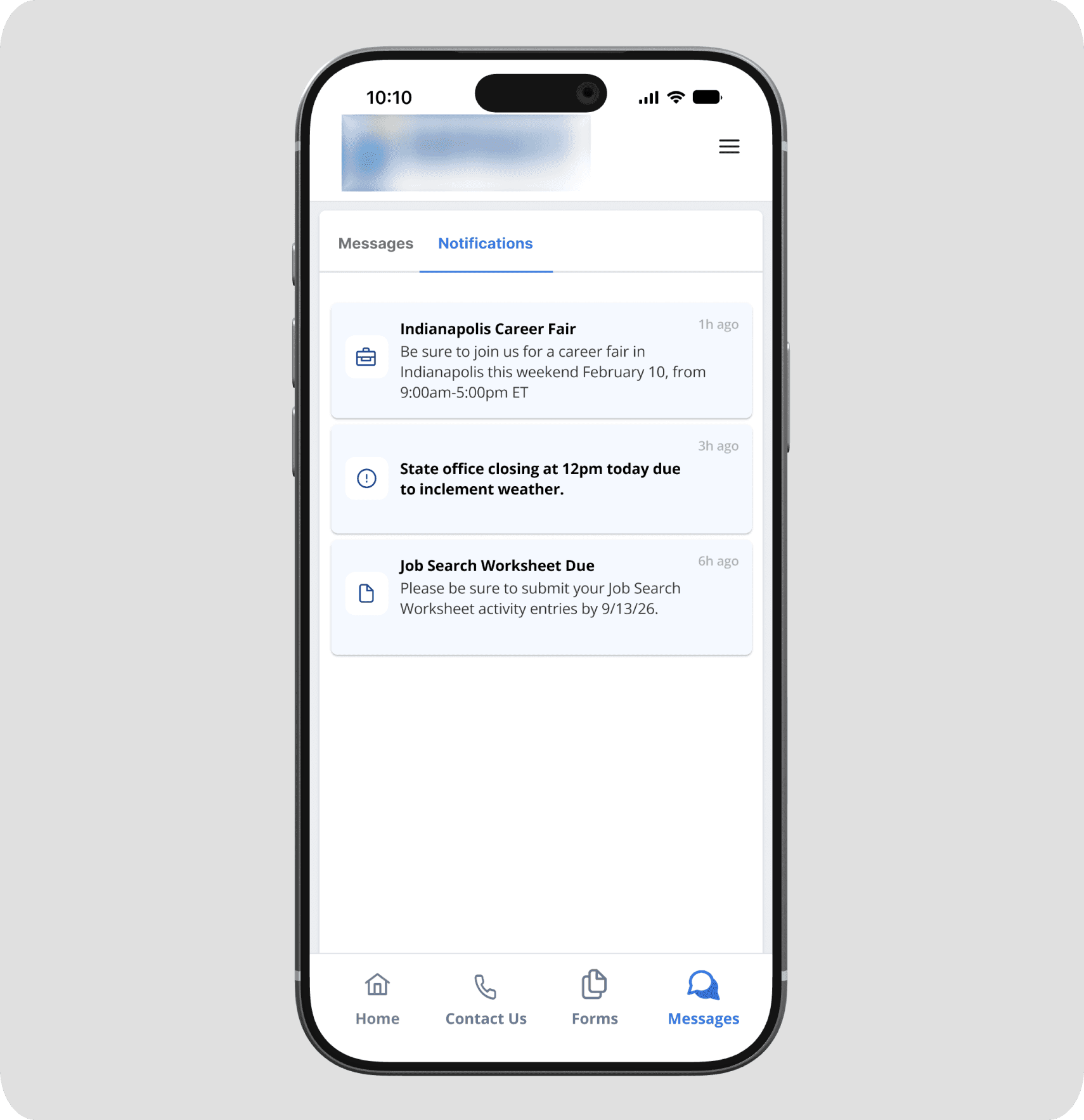
Participants interact with the program through a mobile app organized around four sections. Case managers engage through a messaging interface built directly into their existing desktop system, keeping everything in one place without requiring a separate tool or login.


DESIGN DECISIONS
Three moments that required something more than requirements.
Stakeholder requirements defined what the app needed to do. These three decisions defined how it would feel to actually use it.
What does a participant see before they have a case manager?
New participants can wait up to ten days before a case manager is assigned to them. During that window, the messaging feature has nothing to offer yet. Two options were on the table: hide the Messages button entirely, or gray it out. Neither felt right. A hidden button offers no explanation and could make a returning user think the feature had disappeared. A grayed out button invites tapping and frustration with no path forward. The approach I landed on was to keep the Messages section fully accessible, with a clear and warm message explaining what is happening, how long it typically takes, and a phone number to call in the meantime. The feature becomes a promise rather than a dead end. Participants know it is coming, they know why it is not available yet, and they are not left wondering whether something is wrong with the app or with their account.

How do you make a 24 hour wait feel intentional, not broken?
Every attachment sent through the app, whether a resume from a participant or a form from a case manager, has to pass through a security check before it reaches the other person. That process can take up to 24 hours. Left uncommunicated, that gap could easily feel like a failure. A participant who sends their resume and sees nothing happen might resend it, call their case manager, or simply lose confidence in the app. The solution treats the delay as something worth explaining rather than hiding. The moment an attachment is sent, an amber pending message appears in the conversation thread in plain language, telling the user exactly what is happening and how long it could take. When the attachment clears security, a new message arrives in the thread with a green confirmation. No separate notification. No settings screen to check. The status lives inside the conversation where both users are already looking, on both mobile and desktop, in a consistent visual language across both platforms.

Keeping both users informed without overwhelming either one
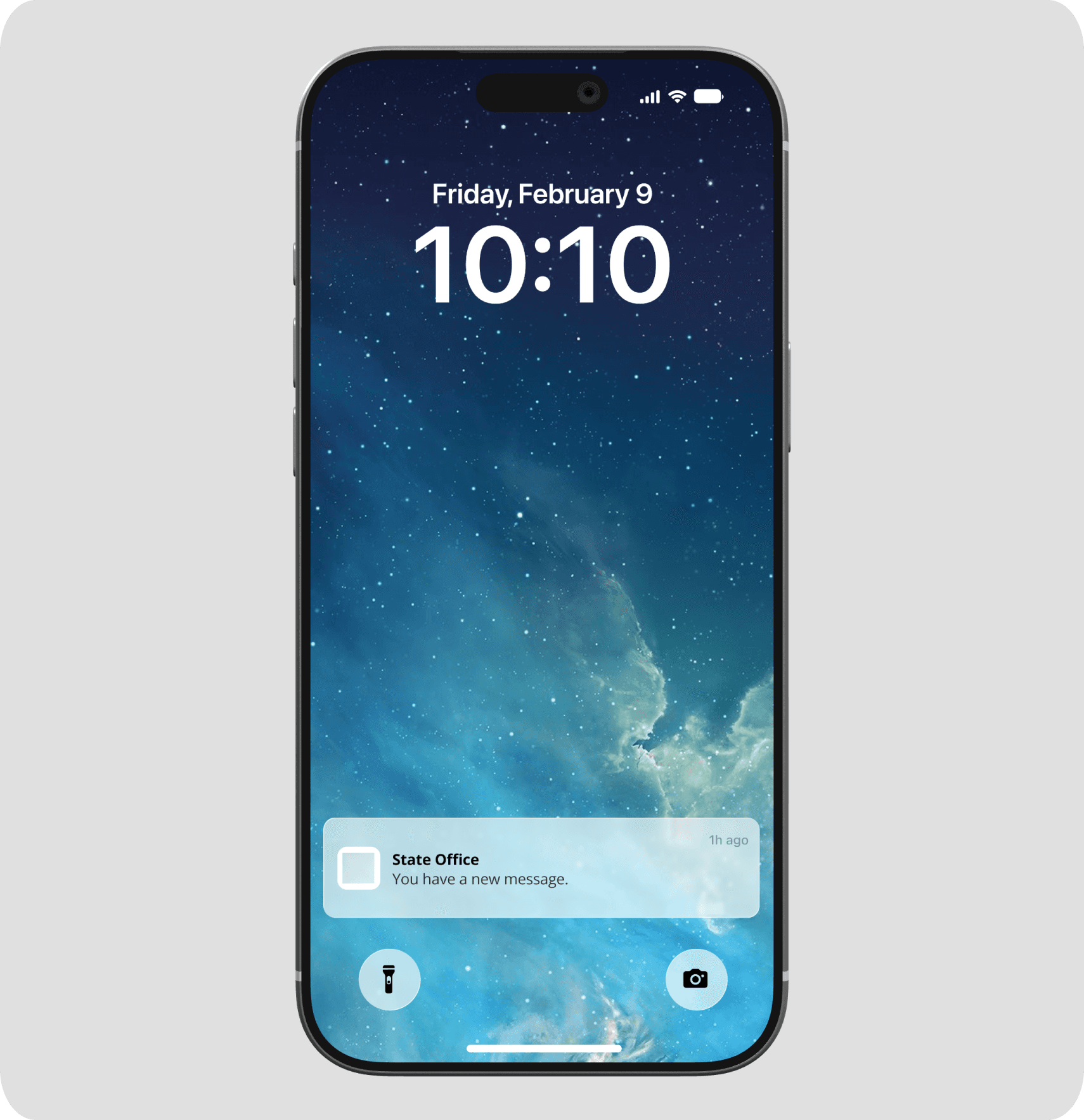
Participants receive push notifications when a new message arrives, surfacing the app even when it is not open. Inside the app, a tabbed Messages section separates direct messages from program notifications like office closures, career event reminders, and form deadlines. That separation keeps personal conversations from getting buried under program announcements while still ensuring participants see time-sensitive information. On the case manager side, unread message counts appear directly in the navigation of the desktop system so nothing requires a separate check or an additional tool. Both users stay informed through the surfaces they are already using.

OUTCOME
Something built to last, not just to ship.
The app was completed and reviewed by stakeholders before deployment. The state now has a platform they own fully, one that will not disappear if they change contractors and was not designed around someone else's constraints or business model. That kind of longevity was the intention from the start and it shaped every decision along the way.
Beyond the immediate product, the communication channel this app creates has implications that reach further than messaging. A participant who can quickly ask their case manager a question about a change in their income situation is more likely to report it correctly and on time. That kind of friction reduction, small in any single interaction, adds up in ways that matter at a policy level.
A searchable office locator is planned for the next iteration to replace the interim PDF on the Contact Us page. Additional form types and online completion capabilities are also scoped for future phases as the platform grows.
REFLECTION
What building something new teaches you differently than fixing something old.
Research informs decisions, even when it takes a different shape
This project moved on stakeholder timelines without direct user interviews or surveys. But that did not mean designing blind. A competitive analysis of existing platforms helped us understand the landscape before making decisions, and personas grounded in real knowledge of the participant population kept human context present throughout. What was missing was the kind of direct conversation with participants that would have sharpened every assumption. That is still something I would seek out if given the opportunity to revisit this.
Related Projects