When the workaround becomes the warning sign
A redesign of the Supportive Services workflow for a state workforce development program, where caseworker friction was not just an inconvenience. It delayed real people from receiving bus passes, job training funds, and basic support. The redesign reduced a 22 page and tab workflow down to 12, and user validation sessions showed case managers were genuinely excited to leave their own workarounds behind.

My Role:
UX Designer, Consulting
Client:
State Workforce Development Program
Methods:
Survey, User Interviews, Redesign
TEAM:
Design, Development, Client Stakeholders
CONTEXT
The program and the people
This state program provides free job training, employment resources, and supportive services to participants receiving SNAP or TANF benefits. People working toward financial independence, often navigate significant barriers to employment.
Case Managers and Career Coaches are the frontline. They request Supportive Services on behalf of participants: bus passes, gas cards, clothing vouchers, and test fees. Each request must be approved before it can be issued, and every service requires a signed voucher. The system tracks limits, statuses, dollar caps, and documentation across five service types.
The process is complex by necessity. What was not necessary was how hard the system made it.

RESEARCH
We sent a survey. What came back surprised us.
We surveyed 35 users across roles including Case Managers, Career Coaches, Regional Managers, and Receptionists. Nearly half had five or more years of experience with the program. These were not new employees guessing their way through. These were seasoned professionals who still found the system confusing.
A note on process: We used Maze to distribute the survey and leveraged its built-in AI sentiment analysis to help synthesize open-ended responses. The tool also enabled adaptive follow-up questions based on participant answers. All AI-generated summaries were manually reviewed before informing any design decisions.
“It has gotten easier with practice and remembering past mistakes”
CAREER COACH
5+ YEARS EXPERIENCE
The voucher description field was the central pain point. It was a free-text box with no instructions, no guidance, and no examples. When it was not filled out correctly, the request was rejected. Those rejections were not just a system error. They meant a real person waited longer for support they needed. That quote stayed with us throughout the project. Remembering past mistakes should not be how people learn to use a system that affects someones path to employment.
THE PROBLEM
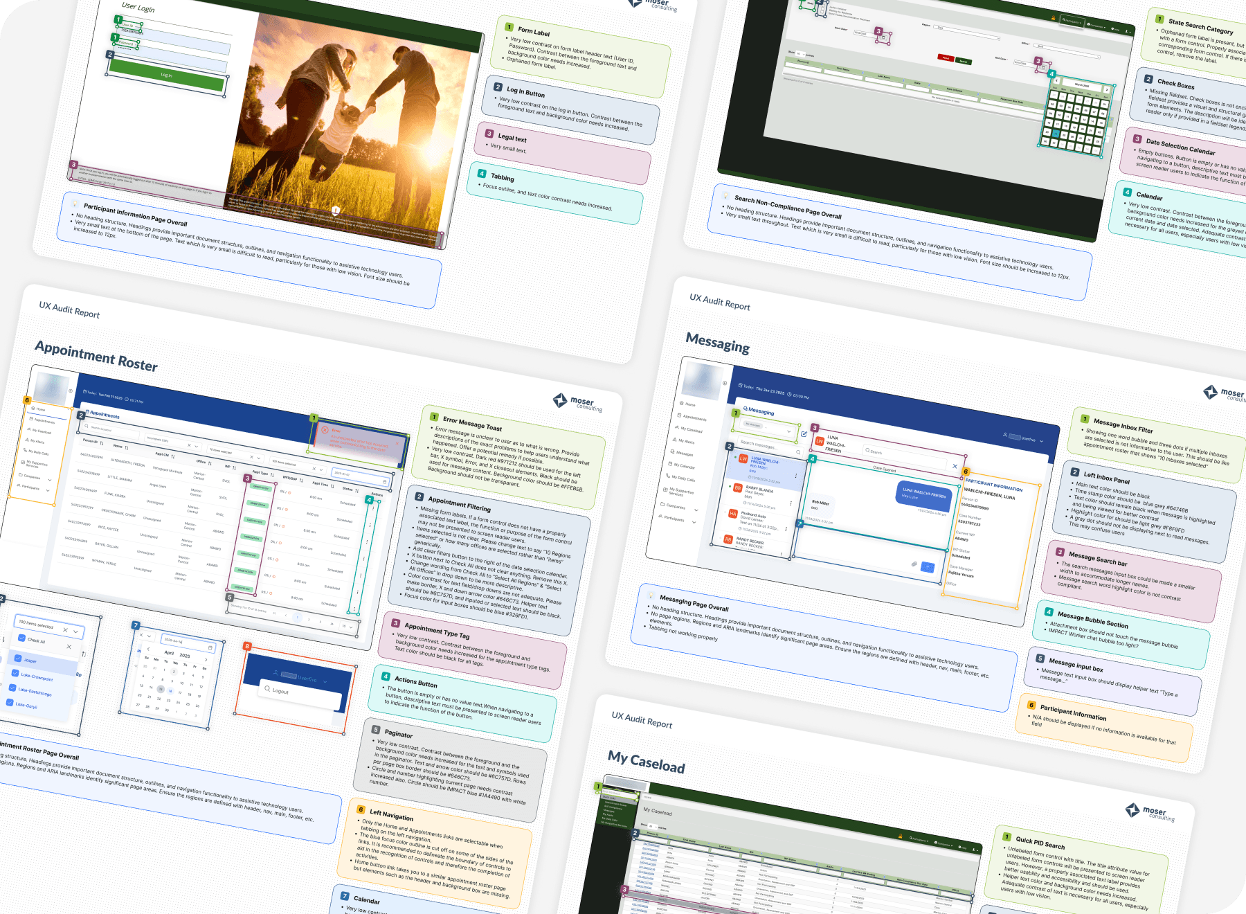
Before: a system that taught through failure
The original interface was functional in a narrow sense. You could submit a request. But it offered almost no guidance on how to do it well, and the consequences of doing it wrong rippled outward to the participants waiting for help.


Before
Blank voucher description text box with no template, no guidance, and no examples
Rejection returned users to the start with no inline context about what to fix
Single serial number field for multiple pre-paid items
22 pages and tabs across the full workflow
Participant overview showed raw totals with no visual breakdown by service type
Details page used tabs, hiding information behind extra clicks
DESIGN DECISIONS
What we changed and why

We absorbed the Excel file into the system
Users had built their own template workaround outside the tool. Rather than replace it with something unfamiliar, we took what they already trusted and built it directly into the request form, auto-populated where possible, with bracketed placeholders for case-specific details. We proposed a structured line-item input for the request descriptions, but users told us they preferred to type freely rather than navigate dropdowns. We listened and kept the template approach.

We made rejection reasons impossible to miss
Previously, a caseworker returning to fix a rejected request had to remember or re-find why it was rejected. In the redesign, the rejection reason appears as a prominent alert at the very top of the edit form, before they have touched a single field. No more memory tax on an already demanding job.


We unified four screens into one
Four separate views for different service statuses were consolidated into a single screen with two tabs: In Process and Issued. This came directly from user interview feedback. Caseworkers wanted to see everything in one place without navigating between pages.

We rethought serial number entry
The original system had a single long text box for all serial numbers, even when issuing multiple bus passes or gas cards. We replaced this with an add-another pattern, giving each card its own field with individual replace and void actions. A pain point surfaced in user interviews became a specific, testable design solution.


OUTCOME
Validated by the people who know this work best
The redesign was validated through user review sessions with Career Coaches and stakeholders. Feedback was consistently positive. Users felt the new flow was significantly faster and required fewer clicks to complete common tasks. The auto-populated voucher template received particularly enthusiastic responses from caseworkers who had been managing their own workaround for months.
One of the clearest signals of success: users who had built and maintained that Excel file were genuinely excited to see it made unnecessary. The project is currently awaiting development and deployment.
REFLECTION
What I learned
Related Projects