Accessible to all who serve: uncovering barriers in a state workforce system
Grounded in empathy and guided by WCAG 2.1 Level AA standards, this audit uncovered 38 or more violations across nine screens, surfaced an unexpected finding about newly redesigned work, and changed how our team integrates accessibility review into the development process.
My Role:
UX Designer, Consulting
Client:
State Workforce Development Program
Methods:
TOOLS:
WAVE, Manual Keyboard and Screen Review
CONTEXT
Every barrier in a system is a barrier for a real person
This state workforce development program helps participants receiving SNAP or TANF benefits gain skills, build resumes, and find employment. The system that supports that mission is used daily by state employees including case managers, regional managers, receptionists, and facilitators.
As new legislation brought stricter accessibility requirements for government systems into effect, it became clear the application needed to be evaluated against WCAG 2.1 Level AA standards. Accessibility had always been a legal and ethical obligation. Now there was urgency to understand exactly where the system stood.
Accessibility is often framed as a technical requirement. But at its core it is an act of empathy. Every barrier in a system is a barrier for a real person trying to do their job. A case manager with low vision struggling with low contrast text. An employee relying on a keyboard who cannot navigate past a broken focus state. A screen reader user encountering a page with no heading structure and no way to orient themselves. These are the people this audit was for.
This audit began with a question I could not stop asking. The QA team was running automated scans and leadership assumed the system was covered. But looking at what had been produced, it was clear the scans were not catching most of what needed to be caught. During a quieter period between projects I made the case to our director that a proper audit was needed, one that combined automated tools with manual review across a representative set of screens. She agreed and I took it on. I did not want accessibility gaps falling back on the team when the new requirements took effect.


METHODOLOGY
Two layers of testing, because one was not enough.
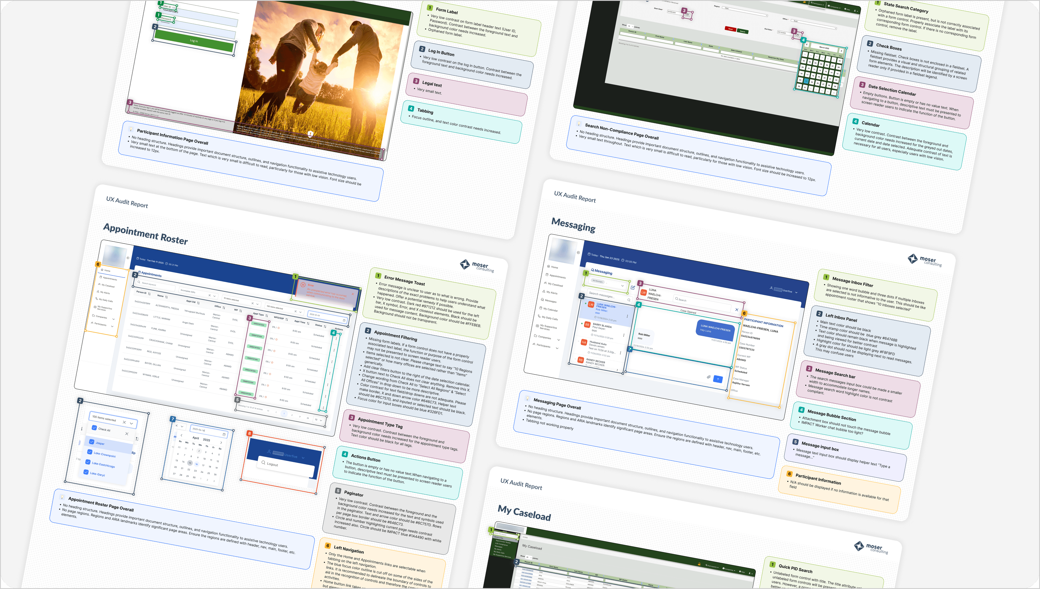
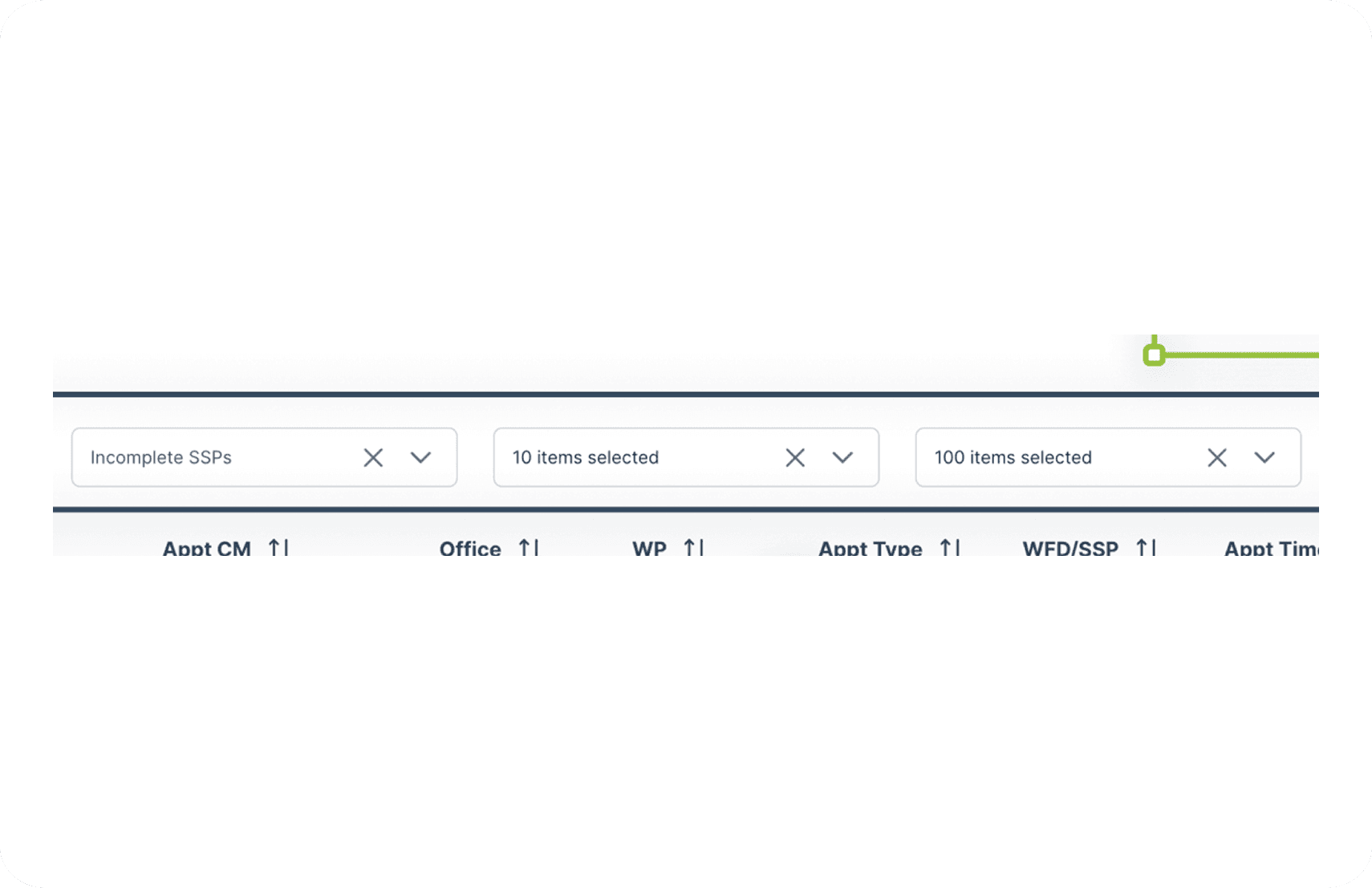
The audit covered nine screens selected to represent the range of layouts, interaction patterns, and user workflows present across the application. Rather than auditing every screen individually, we identified screens that reflected the structural patterns repeated throughout the system. Violations found here were understood to be present more broadly.
Automated testing: Each screen was run through the WAVE accessibility evaluation tool, which identified contrast errors, missing labels, empty buttons, and structural issues. Automated testing provided a reliable baseline but had clear limits. It could not evaluate keyboard navigation, hover states, or the experience of moving through a page sequentially.
Manual testing: Each screen was then reviewed manually, with particular attention to tabbing order, focus visibility, hover state contrast, and the overall experience of navigating without a mouse. This layer caught violations that automated tools consistently missed, including focus outlines disappearing mid-page and hover states that failed contrast requirements.


FINDINGS
The violations were not random. They were systemic.
Across all nine screens, three violation categories appeared without exception. These were not isolated problems on individual pages. They were patterns embedded in the foundation of the application, which meant fixing them required systemic attention, not one-off patches.
Missing heading structure
Every screen audited lacked proper heading hierarchy. Headings provide document structure, navigation landmarks, and orientation for screen reader users. Without them, assistive technology users have no reliable way to understand or navigate the page.
Low color contrast
Contrast between foreground text and background colors fell below WCAG 2.1 AA requirements across all screens. This affects all users in challenging lighting conditions and is a significant barrier for users with low vision. Form labels, status tags, pagination controls, and hover states were among the most common offenders.
Inadequate keyboard navigation
Focus outlines were either invisible or disappeared mid-page on every screen reviewed. Users who navigate by keyboard, including those with motor impairments, rely on visible focus indicators to know where they are on a page. This violation was only catchable through manual testing and would not have been surfaced by automated tools alone.
Insufficient text size
Very small text throughout the legacy screens made content difficult to read, particularly for users with low vision. Font sizes needed to be increased to a minimum of 12px across these pages. Notably this issue was not present on the two newly redesigned screens, suggesting some progress had been made in this area.
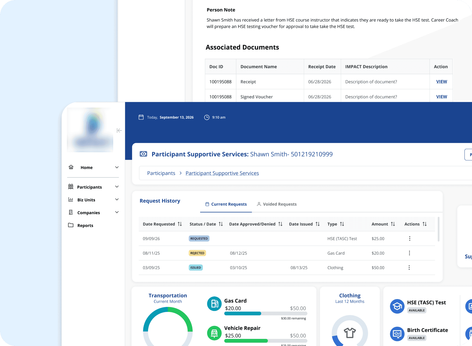
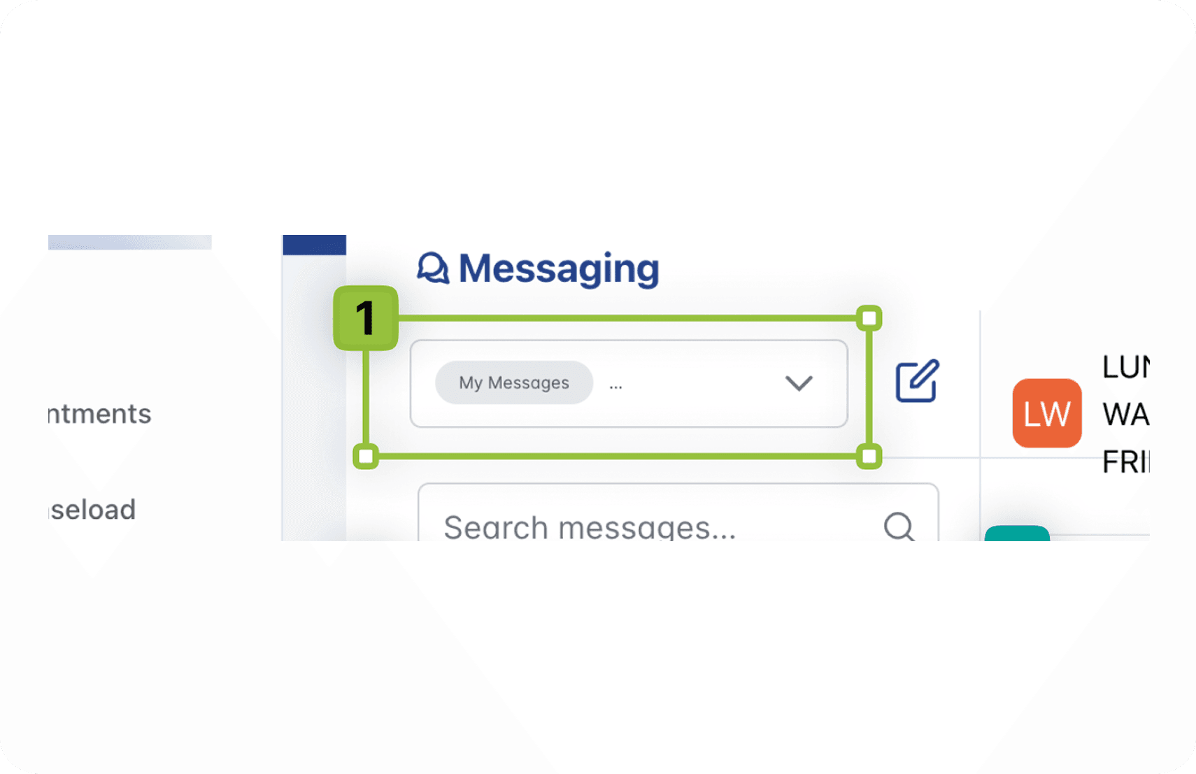
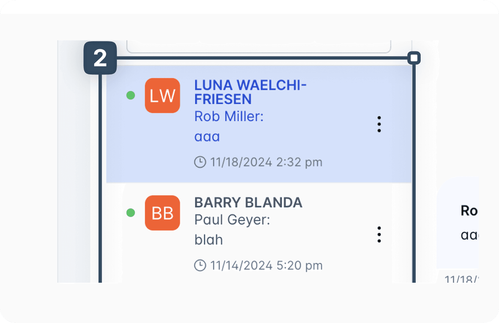
The audit also uncovered a finding none of us expected. The two screens that had been most recently redesigned, the Appointment Roster and the Messaging interface, carried the highest concentration of violations. Our assumption going in was that the legacy screens would be the most problematic. The results told a different story.
A redesigned screen is not automatically an accessible one. Without inspection at the development stage, violations can be introduced even when the design intent was sound.


FULL SCOPE
Nine screens. One consistent pattern.
Each screen was evaluated individually with its own set of findings. The grid below captures the full scope of the audit. The screens highlighted above represent the strongest examples. The remaining five are documented here with their key violation categories.
IMPACT
What this audit changed.
The audit had immediate consequences in two directions. The Appointment Roster had already been deployed when the violations were identified, which meant the development team had to revisit a screen already in production. That process underscored the real cost of catching accessibility issues late: rework, delays, and a system actively in use that was falling short of the people depending on it.
The Messaging interface had not yet been deployed, which gave the team an opportunity to address violations before they reached users. That difference in outcome between two screens at different stages of deployment made the case clearly: accessibility review cannot be a final step. It has to be woven into the process from the start.
For me personally, the most significant outcome was a change in how I work. Before this audit I was less involved in the development inspection stage. Afterward it became clear that a designer needs to be present and active during development review, not just at the handoff. Catching a contrast violation in a design file takes minutes. Catching it after deployment takes much longer and costs considerably more.

REFLECTION
What I carry forward
Speaking up changes things
This audit happened because I asked for it. Leadership assumed the QA scans were enough. I knew they were not and I made the case to do something about it. That experience reinforced something I carry into every project: if you see a gap, name it. Waiting for someone else to notice it is not always an option, especially when the people affected by it are depending on the system to work.
Related Projects