When members cannot find what they came to buy
A UX redesign of the Kappa Delta Pi e-commerce store, where nine distinct usability problems were keeping members from the graduation merchandise they needed most. Research, competitive analysis, hi-fi prototyping, and usability testing with real users confirmed that small, deliberate changes can yield significant improvements in experience.

My Role:
UX Designer, Consulting
Client:
Kappa Delta Pi (KDP)
METHODS:
TEAMS:
Design, Development, Client Stakeholders
CONTEXT
An honor society whose store was working against its own members.
RESEARCH AND DISCOVERY
Nine problems hiding in plain sight.
Research began with background investigation into KDP's member needs, competitor e-commerce sites, and the existing store's structure. Stakeholder input combined with direct user feedback surfaced nine specific user pain points that were consistently preventing members from completing their goals
Design approach: The primary goal throughout was to improve the existing experience rather than make drastic visual changes. Competitive analysis of similar e-commerce sites informed which layout patterns and conventions users already understood and expected, keeping the learning curve low for returning members.
DESIGN DECISIONS
Deliberate changes, not a full overhaul.
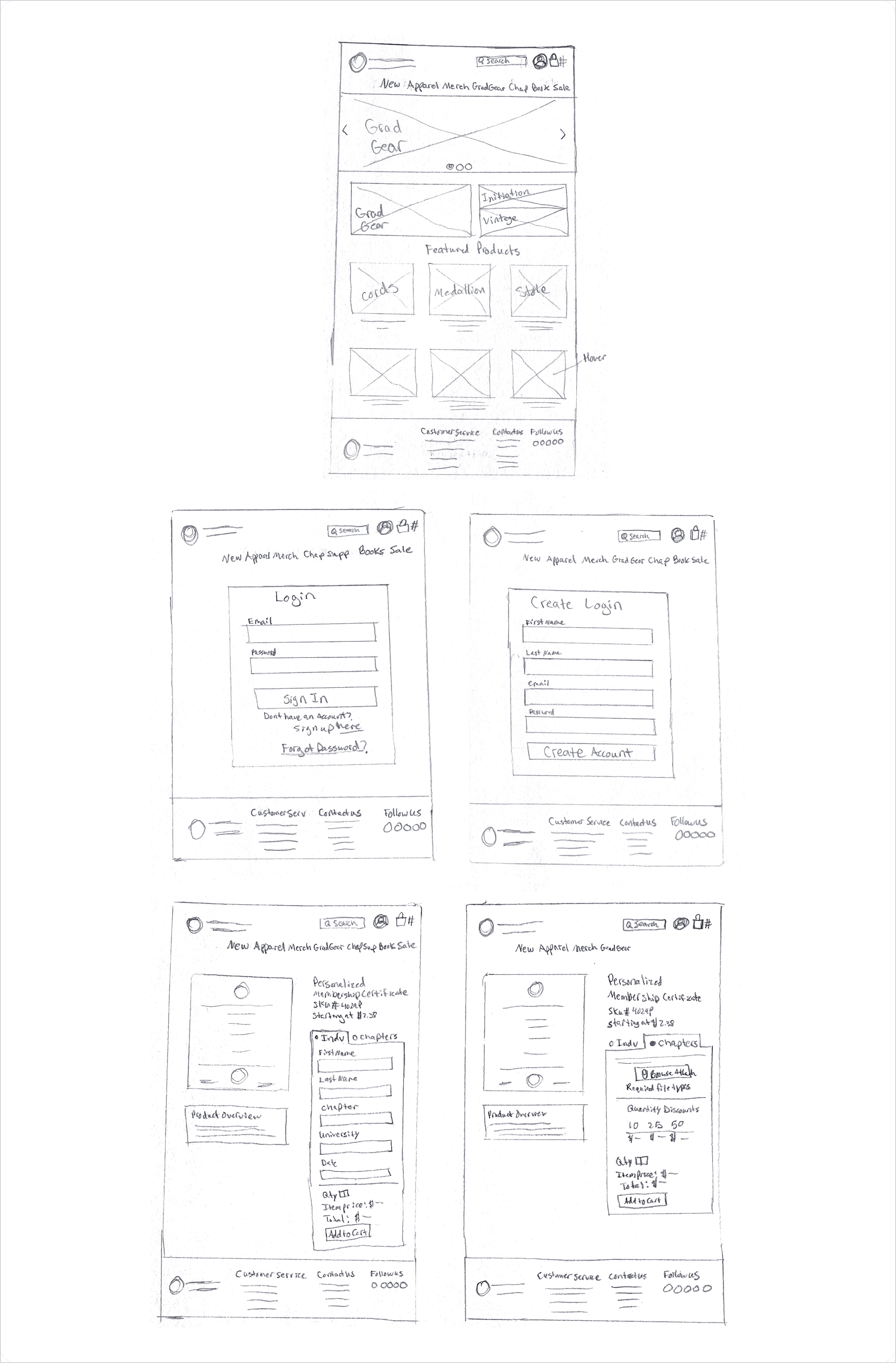
Making search visible and immediately usable
The original search was a small icon that expanded into a tiny input field when clicked, a pattern that was unfamiliar and easily missed. The redesign replaced it with a large, visible search text box at the top of the page that users could click and start typing immediately, following the convention established by the e-commerce sites members already used. The login icon was also moved to the top right of the navigation to match standard placement, and the return policy was relocated to the footer with a clearer label of Returns and FAQ.


Bringing graduation merchandise to the forefront
Grad Merchandise was renamed to Grad Gear, a shorter and more widely used term that felt more natural in navigation. The redesigned homepage featured graduation products prominently in the hero carousel and photo grid, with the top three most sought after products placed first in the featured products section. Honor cords appeared first. The available now section title was changed to Featured Products to draw broader attention rather than limiting the section to recently added items. Black separator bars were removed, creating a cleaner and more consistent product grid, and an image hover feature was added so users could quickly preview secondary product images without clicking through.
Solving the certificate ordering problem with smart form design
The personalized certificate page required members to email their personalization details separately, with instructions buried in the product description that most users never read. The hand sketches were especially useful here, working through the individual versus chapter toggle states on paper before prototyping allowed the logic to be tested quickly without committing to any visual decisions. The redesign introduced an individual versus chapter toggle that showed only the fields relevant to the order type. Individual buyers saw five text fields for their personalization data. Chapter buyers saw a file upload option for their spreadsheet along with a quantity discount chart that was previously hidden behind a tab. The price display was changed to show starting at to clearly communicate that quantity-based pricing was available, and the product overview was moved out of the way of the order entry area to reduce visual competition.


Simplifying the login experience
The original login page placed sign in and new user registration side by side with multiple warnings, text boxes, and a membership distinction message all demanding attention at once. Many users were unsure which side applied to them and felt they needed to fill out everything on screen to continue. The redesign separated the experiences entirely. A clean login form with email and password appeared by default, with a simple sign up here link for new users below it. The page went from visually overwhelming to immediately clear.


Giving initiation and vintage collections proper homes
Initiation merchandise had no visual presence on the homepage and was only reachable through a navigation path that required users to already know where to look. The vintage apparel collection was scattered throughout apparel with no grouping. Both were added to the homepage photo grid to give them immediate visual discovery. The vintage collection also received its own dedicated category under the Apparel dropdown in the main navigation, making it findable through browsing and direct navigation alike. Chapters looking for initiation merchandise could now see it the moment they arrived on the site.
USABILITY TESTING
Testing the assumptions before calling the work done.
Three users completed eight tasks each using a clickable prototype of the redesigned store. Tasks were designed to test the specific problems identified in the discovery phase, from finding honor cords and locating the return policy to placing a certificate order as a chapter and finding the vintage collection.
Most tasks were completed successfully across all three participants. Two areas surfaced opportunities for further improvement.

OUTCOME
Small changes with a meaningful impact on experience.
The redesign addressed all nine identified usability problems within the constraints of a CMS platform that offered limited template flexibility. Users navigated most tasks with ease in testing, with only two areas requiring further refinement noted for future iterations.
The most significant design moment was the certificate page, where a hidden email-based ordering process was replaced with a contextual form that showed members exactly what they needed to submit based on their order type. That single change addressed one of the most consequential failures on the site, a point where members were regularly abandoning or incorrectly completing their orders.
For future iteration, two improvements remain: adding descriptive text next to the login icon to reduce ambiguity, and conducting card sorting research to better understand how members think about product categories and how they interpret the differences between similar items.
REFLECTION
What working within constraints taught me.
Convention is not the enemy of creativity
Competitive analysis revealed that users arrive at any e-commerce site with expectations built from every other site they have used. Meeting those expectations, putting search where people look, putting login where they expect it, putting return policies in the footer, is not a failure of imagination. It is respect for how people actually think.
Testing reveals what assumptions miss
The login icon finding was humbling. Moving it to the right felt like an obvious improvement, and for most users it was. But testing showed that an icon alone still left one person uncertain. That single data point led to a recommendation that would not have come from design instinct alone. Testing is where confidence becomes knowledge.
Related Projects